Location Mölle, Sweden
Project 2013
Completion 2014
Architecture Elding Oscarson


Location Mölle, Sweden
Project 2013
Completion 2014
Architecture Elding Oscarson
Location Vila Nova de Cerveira, Portugal
Project 2009
Completion 2013
Architecture Vírgula i


A Zest for Building
Marcos García-Rojo
There was a time when the act of building was a communal effort undertaken by builders, masons, craftsmen, architects and owners with great boldness, leadership and vision. This shared enthusiasm is scarce nowadays: insurance companies, large consortiums, international management and development companies have replaced these individuals and their will to succeed, their pride and their community involvement, by disengaged anonymous entities, numbers and profits. This fact – which might be considered to be the result of a natural evolution of the modern world towards greater optimization and efficacy – has turned construction sites and, therefore, the built environment, into over-professionalized environments where the extraordinary is not possible as everything is overcontrolled and foreseen. This is the story of something extraordinary.
The Lacoste project is extraordinary for its scale, for the crazy dimension of a project that has been carried out almost in the manner of craftsmanship – involving a very small number of people, with working loads that exceeded traditional responsibilities and ratios. This has, in particular, triggered a broader sense of involvement and communal engagement amongst those individuals concerned, and this energy has fuelled the construction since its beginnings. Without this attitude, without this will to succeed and, once finished, to say “I did it myself and I did it right” the task would have been unbearable.
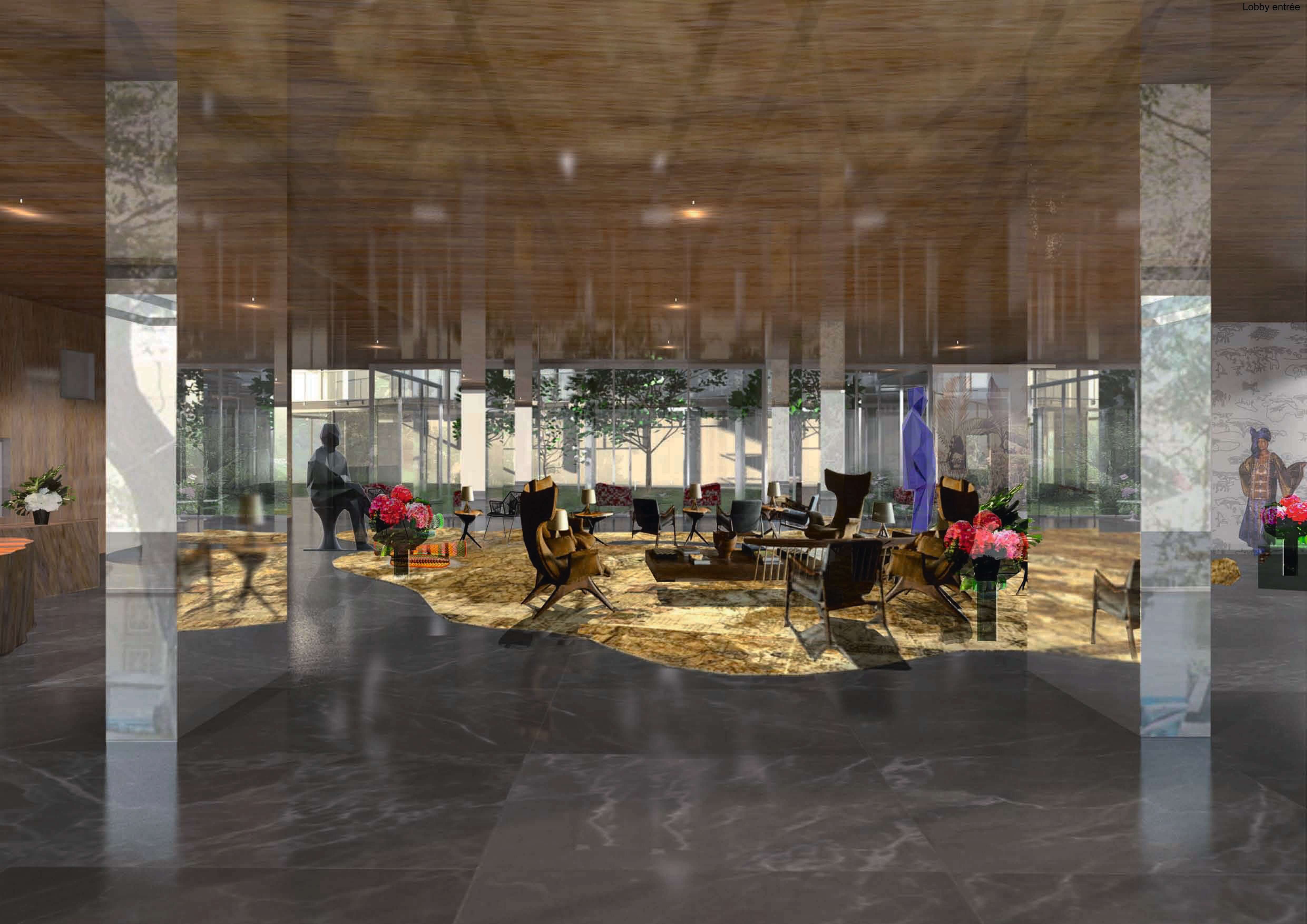
The hotel has 158 rooms, a fitness centre and an event centre. It is in the middle of downtown Dakar, at the edge of the “plateau”, a peninsula which used to be the colonial core of the city. The layout of the spaces challenges the traditional idea of luxury hospitality which relies on the array of sanitary features and the apparent quality of the details. This commercial, standardized approach seems reductive and simplistic here, especially given the character and richness of the context: the environment, the sea, the light are the real luxury here and are treated as materials for design. The rooms are wider than in traditional hotels. More than 98% of the façade is glazed, and a balcony extends the interior in order to take advantage of Dakar’s mild, evening breeze, while protecting from solar exposure. The resulting architecture is a device that makes the most of the view and maximizes the existing qualities.
The degree of involvement of the companies and the effort made by everyone who started the project have been outstanding, allowing all kinds of unexpected factors and difficulties to be overcome – different hotel brands, different
demands, administrative problems, technical issues…
It was in this extremely difficult yet still enthusiastic context that Jofebar joined an already ongoing project. Jofebar felt quickly moved by the potential of the location, the richness of the architecture to-be-built and the character of its developer. As a result, the company brought its savoir faire, its extraordinary craftsmanship but, more importantly, a great dose of resilience, work ethic and positivism. The fact that a project like this, despite all the difficulties, has been able to engage and motivate such a ground-breaking company is further proof of its out-of-the-ordinary nature.
Unluckily, as in every good story, chances are that it comes to a bitter end. The natural tendency of modern times to override these particularities – these eccentricities – is too important. To fight them and to counter them demands a high level of tenacity that, after almost five years of resistance, becomes more and more difficult to achieve.
It has, however, been a fascinating and enriching life-changing experience.
Mahmoud, Anne, Jean-Philippe, André, Sylvain, Bartolo, Ana, Khaori, Monica, Lucien, Bachir, Richard, Pedro, Tiago, Amandio, Côme, Abdulaye, Réda, Lara, Paulin, Khadim, Fréderic, Jeanne, Philippe B., Erwan, Remy, Armel, Rui, Avelino, Yacine, Adrian, Gonzalo, Gregoire, Daouda, Bathily, Sow, Cheikh, Papis, Ma Absa, Arona, Mbaye… but also every single person who ever had anything to do with this project: you have shown me how important it is to keep the zest for building alive. To always remember that this is a collective process and it is important to keep it as it used to be: a generous, joyful act of love.
I do thank you, for your audacity and your courage.
May this text serve as a reminder of what we have achieved – and not what we sadly missed.


Location Dakar, Senegal
Client Private
Project date 2006
Completion 2017
Architecture Lacaton & Vassal
Authors Anne Lacaton, Jean Philippe Vassal with Marcos García Rojo
Collaborators Bártolo Santos, Adrian Alvarez, Ana Fernández, Kaori Pedrazzoli, Emmanuelle Delage
Local architect Atelier d’architecture Réda Sleiman, assisted by Lara Bretones, Monica Rodriguez
Interior design Frédéric Druot, Jeanne Gerbeaud; Frédéric Druot Architecture
Structure E.TE.C.S, Lucien Santolini
Services Solutech / CEFI Dakar
Acoustics Gui Jourdan
Works supervision André Poretti
Objets-Types, Besoins-Vip
Francisco Ferreira
A room is still a room
Even though there’s nothing there but gloom
But a room is not a house
And a house is not a home
When the two of us are far apart
And one of us has a broken heart.
Dionne Warwick, A House is not a Home, in Make Way For Dionne Warwick, Scepter Records, 1964
The Modern Movement’s promise of an architecture for all, which simultaneously established itself as a landscape – physical, social and political – and as a dwelling – first as an emancipated object, then as a constituent and generative part of a much wider territory – would die, according to Charles Jencks, with the demolition of Pruitt-Igoe in 1972, in the city of St. Louis, in the United States of America. In its more radical and literal physical configuration, the architecture of this Movement promoted the immediate articulation between interior and exterior, stating its continuity from the transversality provided by the judicious composition of materials holding a light and ethereal appearance and nature. While, on the one hand, steel threatened to reduce form to its structural condition, glass would otherwise assume the paradoxical condition of an immaterial boundary. The modern curtain wall thus superimposed a real need – that of defining a limit – onto the will of its dissimulation – of the limit, but mainly of its necessity. For the erosion of boundaries was not only a spatial or perceptual proposition, but above all an ideological statement, in the sense that architecture would unify people, would put them into a state of confrontation transformed into a meeting. The need to destroy boundaries was thus the need to construct a seamless social and physical territory, an urban support where nature and
artifice would exist together as an organic whole. The modernist cell would thus conceive the existenz minium as an expanded field, at the same time that, from its conception, the city would compose itself not as a surrounding but as an inevitable consequence.
The Vipp Shelter, an architectural object produced by the Danish company Vipp, is proposed as a shelter, a necessity – or as a response to a need – when in fact it presents itself as an exclusive piece that avoids any kind of confrontation, rather looking to hide itself, to escape… there is no ideology here, of course, but a technical statement, a kind of neo-modernist exaltation, devoid of any generative idea – a deviation which, it should be recognised, has always followed, particularly in the post-war period, the modern project. The Vipp Shelter is thus an end in itself, a type-object, which, contrary to what Le Corbusier wrote in his 1925 text Besoins-Types, Meubles-Types, does not really correspond to a logic of productive rationalisation that reacts to an emergency, but to the capacity – rather to the possibility – of individual detachement, to the technical capacity for promoting such a disconnection and for endowing its inhabitants with a kind of existential lethargy. Long gone is the anguish that, in 1956, the House of the Future from architects Alison and Peter Smithson advocated, no longer a cell but a capsule, no longer part but fragment, which, by reversing the experiences of the early modern, looked inwards and upwards, as if the only existing territory was the one developing within it – that surviving and imperfect garden, a landscape evocating other myths, surrounded by an opaque, neutral shell, a radical assurance of physical survival in the face of the external vacuum.
The standard character of the House of the Future thus set in motion a melancholy disguised as novelty and embodied a drifting movement rather than a place. Blatantly mixed with the epithet of pop product, this house would, about nine years later, lead to a conclusion, as ironic as critical and projective, proposed by Reiner Banham in A Home is not a House, where architecture, almost being re-founded as anti-matter,
finally cemented its status – to the sound of Dionne Warwick – no longer as a building, but as atmosphere.
The statement included in the presentation
catalogue that the Vipp Shelter adapts to any type of landscape or natural condition seems to characterize its existence as a matter of resistance and protection – indeed, of shelter; its definition as a total object further emphasises this condition, reinforced by the rough, darkened appearance of the steel structure and its riveted panels, by the external staircase that seems to invite us to a privileged and vigilant space on the rooftop, by its twelve basement supports adaptable to more or less shapeless terrains. But here the issues of resistance and protection are framed in an all different way and destined only for some, those perhaps exasperated by the urban chaos and craving for nature, apparently understood by the creators of this object as a peaceful and orderly image…
The Vipp Shelter, a product that presents itself, after all, as something exquisite – nothing here is pop – and complementary – nothing here constitutes a basic necessity – is then assumed to be not a vehicle for the most elementary resilience, but an invitation to a state of über-survival, to a greater and privileged state of existence. It is in this sense that its material and referential ambiguity – somewhere between the hermetic character of a Nautilus and the panoramic domain of its eventual
external context – is configured.
Deceptively removed and in tune with the
cosmos, the would-be inhabitants of this fantastic place will therefore have all the conditions to idealise the world…


Location Denmark
Client VIPP
Project date 2014
Architecture Morten Bo Jensen
Project management Morten Bo Jensen
Structure VIPP
Contractor VIPP
Architecture of the see-through
Luis Miguel Lus Arana
Sitting in its privileged location in Valle de Bravo, Mexico, House EH, “La Lagartija”, stands as the distillation of a certain type of modernity, or at least, of the way in which the international style has been absorbed and translated in Latin America since the 1940s. When approached during daytime, the main façade offers a convincingly opaque impression. However, upon entering, or at night, when the inner lighting dissolves the solid brise-soleil of the upper floors, the building reveals its true nature as a tenuous, ambiguous barrier between the front access and the private space of the back courtyard. With its simple, yet effective use of a few key elements of Latin American modernity – pergolas, brise-soleils, excavated porches – the house succeeds in diluting the transition between inside and outside by means of intermediate spaces with varying degrees of permeability and light exposure.
In this sense, the project is firmly rooted in a very Latin American tradition that takes us back to Francisco Artigas’ “Casa del Risco” in El Pedregal, the house that Antonio Bonet designed for Gabriel Berlingieri in Punta Ballena, Uruguay, or the brise-soleil-ridden Milton Guper residence built by Rino Levi and Roberto Cerqueira Cesar in Sao Paulo. Meanwhile, the curving walls of the basement access immediately bring to mind other seminal works of the Spanish-speaking single-family housing tradition such as Juan Antonio Coderch’s Ugalde Residence, with its sinuous shapes retaining the mountain slope and guiding visitors towards the threshold that marks the entrance to the house. And of course, they take us back to a whole other branch of Latin American modernity better represented by the works of Oscar Niemeyer, especially his own house in Gávea, Rio de Janeiro.
With all these houses, but especially with the former ones, the EH residence shares the naturalness with which certain Latin American countries integrated the paradigm shift that emanated from Europe and the United States into their vocabulary. If, in the case of Brazil, it was the raw concrete buildings produced by Le Corbusier that would mark the agenda – even if tarnished by a local tendency to sensuality – Mexico preferred to look northwards, importing the rigorous lightness of the Case Study House program, with Richard Neutra, Craig Ellwood, and Ralph Rapson as its standard bearers. In the absence of a generation which, like Peter Behrens or H.P. Berlage in Europe, represented the transition between beaux arts and modernity, Latin America in general, and Mexico in particular, adopted the tropes and motifs of the international style without their heroic shortcomings. Certainly, the EH House also includes some contemporary styleme, such as the continuous band of concrete/stone that runs through the façade, echoing the remnants of a broken single-surface, or the glass railings. However, beyond these few incidental features, it is seamlessly interwoven into a modern tradition that has been developing, almost unchangingly, since the second post-war period: an architecture whose proven efficiency relies on a pragmatic gestural economy.


Location Valle de Bravo, Mexico
Client Private
Project 2008
Completion 2014
Architecture Gomez Crespo Arquitectos
Associated Architect Gaxiola Arquitectos
Project design Federico Gomez Crespo, Gomez Crespo Arquitectos
Construction José Antonio Gaxiola de Haro, Gaxiola Arquitectos
Team Stefano Menchelli, Ana Elena Hernandez
Interiors Covadonga Hernandez
Landscape Pedro Sanchez
Tetris House
José Mateus
Writing about a house I have never seen in person seemed a strange proposition at first. Even the extraordinary photographs by the Guerra brothers are no substitute for the experience of an actual visit, of being inside the building, immersed in its architecture; they are no substitute for experiencing the light, the proportions, the textures, the passage of time, the cold and the heat.
Drawings and images can never fully convey the way in which the architecture reacts and adds to the circumstances of a location, a brief, the life and aspirations of a family. This is an elementary observation for an architect, and in any other circumstances I would have politely turned down the invitation.
Nevertheless, perhaps because I have always harboured a great admiration for modern Brazilian architecture, the teachings of which have taught me to become a better architect myself, perhaps as a result of the fascination inspired in me by São Paulo, a city I have visited multiple times, or perhaps driven by my deep curiosity for the career of Márcio Kogan, I fortunately decided to accept.
I often say that I do not believe in an architecture of powerful concepts at the expense of habitability. There is no shortage of examples of this kind of architecture, popularised by a press thirsty for strong, compelling images. However, the Tetris house demonstrates the architect’s great maturity, revealing an architecture of great clarity, in which I can imagine a comfortable, sophisticated and happy life.
The design strategy rests on a great portico in the shape of an inverted “U” which protects and shelters a fluid interior, closed where appropriate for reasons of privacy, built from wood. However, the boundaries drawn by the wood are not opaque, unfurling into a series of narrow openings allowing a certain degree of permeability.
Indoors and out are naturally interconnected, with a clear complementarity between indoor life and the garden/swimming pool. To achieve this effect, the architect uses a long wooden deck reaching into the garden, which gives the impression of having been taken from inside the house. The boundary between the interior and the exterior is radically dematerialised by glass walls featuring elegant frames in a minimal design.
I can easily imagine a family and friends in the midst of a lively party on a warm São Paulo evening, gliding freely among the succession of spaces between the garden and the covered terrace. Ultimately, this is another key feature of the project: the generous manner in which space opens itself up to the house’s inhabitants.


Location São Paulo, Brazil
Client Private
Project 2008
Completion 2013
Architecture Studio MK27
Authors Marcio Kogan, Carolina Castroviejo
Team Fernando Falcon, Maria Cristina Motta, Mariana Ruzante. Studio collaborators Eduardo Glycerio, Gabriel Kogan, Lair Reis, Mariana Simas, Oswaldo Pessano, Renata Furlanetto, Samanta Cafardo, Suzana Glogowski
Interiors Diana Radomysler
Landscape Renata Tilli
Structures Pinto Rodrigues Engenharia Estrutural
Contractor All’e Engenharia / Eng. Luis Esteves Caldas Neto
House L1
Tomas Lauri
House L1 falls neatly within the street of the former fishing community of Limhamn. It connects to the pavement just like the other houses and is the same height as the other houses. Nor does the whitewashed facade stand out significantly. It is an architecture that distinguishes itself in the details rather than the structural features. This is clear when you leave the street and enter the courtyard.
Inside the courtyard, the positioning of the windows changes from the street side – giving the overall impression of a free order – and the apartments take on their own individual expression. Each one is different. Across from the street side building that houses five duplex apartments, there is a building within the courtyard with two residences arranged over three levels. The most striking aspect from within the courtyard is the high sliding glass partitions that reach over two floors. The advantage of these high partitions is, of course, the amount of light that fills the double-height dining areas, but they also provide a welcome opportunity for vistas from the mezzanine and staircase within each home.
Much of the project was about defining and characterizing the room volumes. Sure, each room has different features, but there is something else about the apartments’ solutions. They can be described as a sum of varying volumes. Each room has a different width and height, and different window sizes offer different degrees of daylight, thus imbuing each room with its own type of natural light. For example, the home office area within each of the courtyard house apartments has just a skylight, which creates a studio feel. The materiality of the project was very much about defining and supporting the volumes. White walls, woodwork in oak and grey sandstone floors allow light and shadow to play freely.
The treatment of the rooms can perhaps, be best described as a Nordic asceticism. If you go into a Swedish medieval church there is a sense of kinship. Sober, balanced volumes, rooms without opulence and at the same time, a place that radiates calm and contemplation. Lindvall has often emphasized the psychological power that architecture possesses; that it can refine a man, or at least make one feel calm. The removal of the unnecessary – of what is gaudy and extravagant – is a way of shutting out the urban disturbances, so one can relax.
But the project is as much about creating community as it is about seclusion. A strong social pathos was the basis for grouping the apartments, which is largely based around the shared courtyard. For most of the apartments, the courtyard is an extension of the living area. This is made apparent, not least, by the stone that is used on the ground level of these apartments. This creates the feeling of a large communal square, or “piazza”. In addition, in the middle of the courtyard is a swimming pool to gather around. This results in housing that makes it easy to be a part of the community. The garden is a place to be visible and to be sociable, as well as a link between the private residences and the street. It is also very easy to enjoy the scenery, to move freely between inside and outside. To join the community, one only has to push aside the glass section and step out.


Location Limhamn, Sweden
Client Private
Project 2011
Completion 2012
Architecture Lindvall A & D
Authors Jonas Lindvall
Collaborators Mikael Ling, Björn Förstberg
Structural Engineering Istvan Szlavi Engineers
Contrator Håkan Wilhelmsson Byggnads AB
Water Cherry House
José Miguel Rodrigues
The primitive form of a temple, or rather the primeval form of a temple. (1)1. The hesitation and the play on words is justified and deliberate. The primitive form of a temple in the sense of archetype of the classical temple relating to the literary history of the term, in the sense that Marc Antoine Laugier attributed to his primitive hut. The primeval form of a temple in the sense of the first form acquired by the classical temple since time immemorial, that is to say, the Greek temple which was succeeded by the Roman temple and, subsequently, since the renaissance, all the successors and offspring of this idea, being continuously updated. Essentially, the first hypothesis is that of primitivism, the second, that of classicism. The first looks for the archetype (of the primitive hut) to rediscover the strength of the first idea. The second seeks instead to tie up loose ends, i.e. the modern substitute for the ancient temple, in the conviction that they contain, integrate and improve on all previous ones, without excluding any of these ancestors.[/index] A domestic interior and an exterior of domesticated nature. In the sense of seeking to dominate nature, but also in the sense of being like nature. In short, the age-old idea of the Japanese garden. Tradition. The tradition of the craft and the tradition of Japanese architecture, that is: tatami, shōji and fusuma, at least. That’s all Kengo Kuma needs to design a house. Let’s see.
The house is like a sum of smaller houses that, resorting to that first image of the home, ever present in architecture, emulates the constructive and formal idea of the temple as an ideal home for equally idealised gods. The roof is therefore always gabled (the word assumes here an almost literal character). Its frontal view always shows the raking cornices of a pediment (from a western perspective of architecture). In the case of traditional Japanese construction, timber lightens the structure. The space around the interior calls for a second peripheral roof, also naturally inclined to the outside, that drains rainwater to the germinating land. The rest (not a remnant though) is: tatami, shōji and fusuma. From a western perspective, these correspond to the floor, the windows and the walls.
In Japanese culture, as we can see from the low point of view of the camera with which Ozu makes his films, the floor is the domain of living. In the West, everything is prudently moved away from the floor. In Japan the floor is the focus of domestic life. It’s no different in the Water Cherry house.
In Japanese culture, it is the shōji that filters the light and obscures the view of whoever is inside. The shōji, like windows, have adapted well to modern glass. Since the invention of this material, inside and outside (exterior and interior) can remain in communication (through looking) and without communication (from the point of view of the other senses, especially, sound, touch, and smell). That’s how it is in the Water Cherry house.
In Japanese culture, the fusuma, by sliding, allow different spatial configurations within the same space. They are movable walls, walls that contradict the stability which is specific to them and that dispense with their characteristic immobility to allow entering and exiting like a door, but also rearranging dimensions, proportions and the orientation of spaces. In the Water Cherry house the glazing appears to behave like fusuma.
The Imperial town of Katsura, as Bruno Taut seems to have been one of the first to understand from a Western perspective, is the insurmountable reference to Japanese garden architecture. Kengo Kuma tells us that he discovered the tradition of Japanese architecture while studying the History of Architecture in New York. The Water Cherry house is the result of this lesson.
Kengo Kuma is a cultured architect who does not shy away from the toughest issues. Naturally, he says of some of his past works, in which the expression of tradition had not yet been found: “To be honest, sometimes I feel a bit embarrassed by some of my buildings”. [footnote index="2"]2. https://www.dezeen.com/2017/01/20/kengo-kuma-architecture-interview-embarrassed-some-buildings-kenzo-tange-olympic-stadium The Ionian monumental nature of the M2 building in Tokyo is an experience that has no echo in the Water Cherry house. Since the tsunami of 2011, Kengo Kuma is a different architect. Today he recommends humility to architects. (3)3. https://www.dezeen.com/2014/03/11/kengo-kuma-interview-architecture-after-2011-japan-tsunami


Location Eastern Japan
Client Private
Completion 2012
Architecture Kengo Kuma & Associates
Author Kengo Kuma
Structural Engineering Makino Structural Design
Electrical Engineering Kandenko
Mechanical Engineering Taisei Setsubi
Absence of display
Hans Ibelings
Suffice it to say that this is a freestanding volume containing three apartments and a communal roof terrace overlooking the Atlantic, above a commercial space on the ground floor and an underground car park.
The three units consist of west-facing living spaces with an ocean view, and bedrooms facing the small street to the east of the building. In between are the kitchens, the stairs and the elevator. An alley leads to the main entrance of the apartments; at the other side, a ramp gives access to the parking in the basement. The north and south elevations are mainly closed, while the east elevation is partially open, with deeply recessed windows to ensure privacy and to allow for small balconies. The west elevation is glazed, behind the same concrete grid as on the opposite side, offering a vertical framing of the horizontality of the oceanic panorama.
The upper storeys are set back, to scale the volume in its context. Similarly, the form is calibrated to be parallel to the street and the neighbouring building, without in any way reducing the verisimilitude of complete rectangularity.
This architecture intentionally lacks an interesting form, and comes almost without colour. There is no flaunting of exquisite materials, no suggestion of design virtuosity. The effect of this deliberate absence of display is paradoxical in a setting of fairly ordinary buildings. Surrounded by architectural unpretentiousness, this project stands out as supernormal, to adopt the powerful term of Naoto Fukasawa and Jasper Morrison. And exactly because of its supernormality, it manages to unveil the everyday charm of its neighbours, which suddenly appear to have an inconspicuous quality that otherwise may have gone unnoticed. This quality would most certainly have been eclipsed by any architecture that ostentatiously aimed at being exceptional. Conversely, this building can fully articulate its supernormality only because its surroundings are normal.
What is true for the exterior applies equally to the interior. The organization of the programme for each unit has a similar self-evidence as the external appearance. Neither interior nor exterior are conventional or standard, yet they both have a seemingly inescapable logic associated with the customary. This architecture not only suggests that nothing could be added or taken away without diminishing its beauty or logic; this also implies that these two categories overlap here. The beauty resides in the logic.


Location Porto, Portugal
Client LPSM, Empreendimento Sra. da Luz
Project 2009-2014
Completion 2016
Architecture Souto Moura Arquitectos Lda
Author Eduardo Souto de Moura
Team Collaborators André Campos, Luis Peixoto, José Carlos Mariano, Ana Patrícia Sobral, Maria Otília Aires Pereira, Susana Oliveira Marques, Rute Peixoto
Structural Engineering Rui Furtado, Carlos Quinaz, AFAconsult
Electrical Engineering Maria da Luz, AFAconsult
Mechanical Engineering Marco Carvalho, AFAconsult
Contrator Matriz Sociedade de Construções Lda
House in the Alentejo Coast
Frederico Valsassina
An apparently infinite woodland on the Alentejo coast. Among pine trees and cork oaks, with a total scarcity of reference points, a white and initially pure mass arises from the terrain. The subtraction of a large concentric cylinder results in a slender volume, attuned to the trees and the existing landscape.
The resulting negative, beyond the scale of a courtyard, traces a perfect circle which seeks to embrace a piece of the surrounding scenery, enveloping it, and fully opening up to the vast blue of the Alentejo sky.
The built mass of the house develops on the edge of this circle. What is inhabited is the perimeter, the surrounding area, which narrows or widens according to its relationship with that great empty space.
In this tense and continuous relationship which is established between the exterior and the confining white mass (as in so many of his creations), light is the primary agent in the material definition of volumes, spaces and objects. Each environment and context is moulded and united by that line of light, which harmonises the opposition between the solid and recognisable limit, and that idea of circular absence embracing pine trees, land, and the remaining empty spaces.
The design seeks transparency, and at the same time opacity. This balanced and connecting synergy of contrasts is balanced by intermittent, large (but controlled) openings, where necessary.
The apt and proportionate measure of these openings continuously reframes the inhabitable depth, first, because it invades it, and then because it cancels it out. The act of inhabiting – and its raison d’être – takes form in the fluid complementarity established with the surrounding exterior in its full expanse. The “house volume-external void” aggregate is transformed, becomes inseparable, affirming itself as a unified, coherent and connected whole.
The indelible presence of these extensive glazed areas highlights the building’s quality as a circular border which opens and yet encloses, rupturing it, exploring it, precisely and punctually framing it. Light is apprehended. Nature is revealed. A frank and intense relationship is formed.
With life, and with a sense of time, (in)finite.


Location Alentejo, Portugal
Client Private
Project 2008-2011
Completion 2015
Architecture Manuel e Francisco Aires Mateus
Authors Manuel Aires Mateus, Francisco Aires Mateus
Project leader Maria Rebelo Pinto.
Collaborators Vânia Fernandes, Maria Bello, Bernardo Sousa
Landscape F I C Arquitectura Paisagista
Engineering Axial
Contrator Mateus Frazão